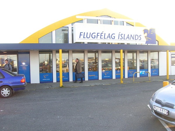

The Reyjavik airport is a small domestic airport, only a five minutes walk from the city center. The design is very simple using an interesting combination of color: yellow and blue, which gives it a youthful feel. Since it's not the main international airport of Iceland, the design is not as elaborate as the Keflavik International Airport (A very nice airport). For example, I couldn't find any pictures showing art pieces in the airport.
OTTAWA MACDONALD-CARTIER INTERNATIONAL


The Ottawa airport has some great natural features. I particularly like the waterfall, the stone sculpture and the canoe. The pub is also interesting. I think these design elements give visitors a good glimpse at Canada's identity.
source : Flicker Members 1,2,3,4,5, 6, 7 | Wikipedia

Iceland is at the top of my list of countries that I want to visit :-)
ReplyDeleteThe Ottawa airport is actually quite nice. I love the waterfall wall.
Thanks for the congratulations on my home office win. I still can't believe my little office won the category!!
Kelly