
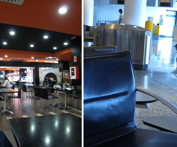
The airport very often gives the first impression of country to tourists. It's interesting to see how the look and organization of an airport speaks volumes for the culture of a country. During our trip last summer, we noticed quite a bit of difference between the airports in Ottawa, Frankfurt, Madrid and Ibiza and found that there was a link between the look of the airport and the way locals behaved. The choice of colors, pieces of furniture and signage all had a flavor of the country and the city (there was a noticeable difference between Madrid and Ibiza). So how do the capitals of the top 10 countries compare when it comes to the design of their airports?
I started by looking at the logos for each of the airports: What they use to represent themselves on paper. It's interesting to see that blue is the most popular color. Most cities chose a symbol that represented a plane or the movement of a plane. My favorite one is the logo for the airport in Paris : the Eiffel tower with wings. It's very creative and not as serious as the others. It has a very clear identity. you can't use it anywhere else.
Logos for Oslo Airport, Canberra Airport, Reykjavík Airport, Ottawa/McDonald Cartier International Airport, Dublin Airport, Schiphol Amsterdam Airport, Stockholm-Arlanda Airport, Paris Charles-de-Gaule Airport, Bern Belp Airport, Haneda Airport
Next, we'll take a look at some design elements in each of the airports.
source : MOOT | Wikipedia
No comments:
Post a Comment
Note: Only a member of this blog may post a comment.