26.2.09

Kevin Deevey's Modern Manhut

A local architect, Kevin Deevey, recently created a modern "manhut" in his backyard. Because of the lack of space in his home, he decided to create a shed/office in his backyard. Unlike most sheds in residential neighborhoods, this one is designed with a modern flair, using features such as a commercial curtain wall in the front and corrugated steel siding. The commercial curtain wall is such a great idea, it really opens up the small 10 x 10 ft room to the yard.


link

20.2.09

Third Avenue Home

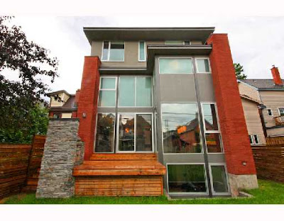
This million dollar home is just magnificent! A beautiful home in the Glebe, currently for sale in Ottawa. This home was designed by Barry J. Hobin and Associates Architects and built in 2005. It has tons of natural light due to the massive windows both in the front and back of the building. I love the use of red brick accents. It helps the house blend into its environment, nestled between two traditional buildings on either side, while keeping its own personality. I remember one of my teachers, who was an architect, used to say that designers tend to create with the users in mind, while architects tend to create with the surroundings in mind. It seems like this was the case for that home. The interior is just as nice. There's a huge glass wall in the center of the home, which acts as a major focal point. You can see it as soon as you come in. (I wonder if they thought about using it as a water fountain). The floors are heated too. The orange wall in the dining area definitely adds interest in the room. I like how the chairs blend into the wall and the placement of the three pendant lights above the dining table as a contrast to the wall. There seem to be a very sleek fireplace in the wall of the living room a bit off to the side, next to a nice little alcove to place beautifully shaped objects (3 square planters in this case). It kind of reminds of the way Kelly Hoppen places accessories in a room. The sculptural light behind the sofa is a nice touch too. There's a sink placed in a interesting area: right in front of a bed, enclosed in a lime-green box. A bit reminiscent of some european hotel concepts.

Why MOOT?

I've always been intrigued about this city I've been wanting to move here and experience it. A couple years ago during one of my many visits to Ottawa, I bought the Ottawa Life Magazine to learn more about the city. The editor's article struck me. Harvey F. Chartrand, wrote that "we [Ottawa] have become the capital of dull and ugly - the result of years of penny-pinching, misguided federal policy and poor civic leadership". He also went along and said that "a concerted effort should be made by all levels of governments to beautify the downtown before it's too late". Being the creative person that I am, the first thing I thought was : "I'm in!". A Couple years later, here I am (finally!) as an interior designer, ready and hoping to become part of the make-Ottawa-beautiful-again project.

I think first, I need to discover the good, the bad and the ugly. This is one of the reasons why I started this blog. I'm definitely more into modern and avant-garde concepts in design and architecture (as you can see in my M2JL:: STUDIO blog), as well as fashion and art. I'm also looking for like-minded individuals, in the region that would also want to take part in this project because it's definitely a team project.

I believe that Ottawa has all the tools to become a world leader and that there are already a lot of good things happening here. And it seems like I'm not the only one who thinks that way, as shown here.

LinkWithin

Related Posts Plugin for WordPress, Blogger...