28.7.09

Try a little bit harder... in hotels too!

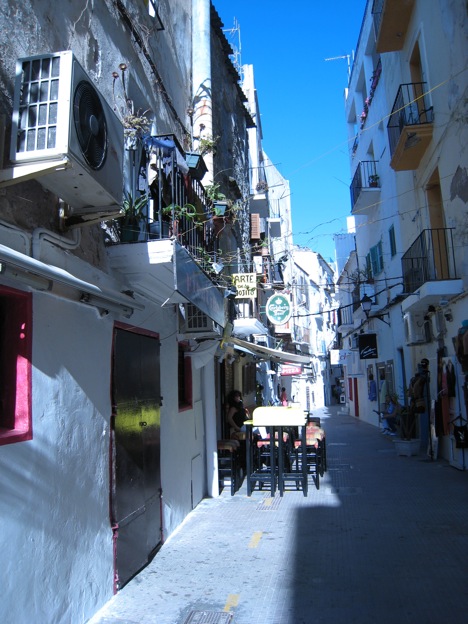
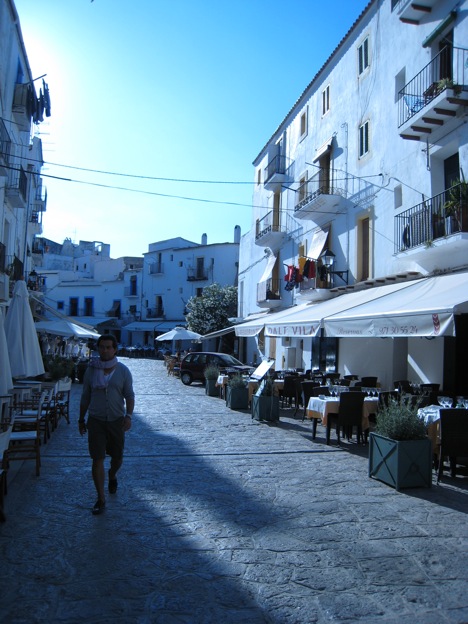
I read an interesting post on Girl About Otown on the state of many restaurants in Ottawa and it made me want to expand on that subject. I think hotels, motels and B&Bs in Ottawa should also try a little bit harder. Here's the thing: Ottawa is the nation's capital of one of the most prosperous countries in the world, and with year-round tourism activities, the city should have some of the best hotels in the world. Of course not every hotel has to be an expensive luxury hotel, but most of them need an identity and more personality. (Seriously, how many clone rooms with boring beige furniture and faded flower bedspreads do we need in Ottawa?) Take a look at places such as the CitizenM or Motel One for example. They offer something unique, without being too expensive. Unfortunately, when you look at some of the most popular and original hotels around the world, it seems like Ottawa is far behind.

Did you know that there was Jail-Themed Hostel in Ottawa? It's called Hi-Ottawa Jail Hostel. It's a beautiful building with a lot of great potential but it's just not up to par when you compare it with the Alcatraz Hotel in Kaiserslautern, which is also a prison-themed hotel.

See for yourself:


Entrance
It's a bit difficult to judge the entrances because you don't get the same perspective. These pictures were taken straight from their website. Still, which one looks more enticing?

Entrance of Hi-Ottawa (source: HI-Ottawa)Entrance of AlcatraZ (source: AlcatraZ Hotel)

Rooms
There is a huge difference when it comes to the look of the rooms. In Ottawa the rooms look tired. There is no clear personality and consistency in the rooms so they don't necessarily look like they are from the same building. In fact it's hard to see the "prison" theme in the rooms.

Source: HI-Ottawa

On the other hand in Kaiserslautern, there is a clear common thread between the different rooms. There's definitely a bit more attention to detail in the design and decoration of the room. They look clean and fresh. The prison theme is there without forgetting that it's still a hotel. Can you guess what they did to convey the prison-feeling into their rooms?

Source: AlcatraZ Hotel and Flickr (Christinamh)

Common Areas
When it comes to the common areas like the lounges and the cafeteria, hands down, AlcatraZ did a much better job. It's simple, clean and original. For HI-Ottawa, it looks more like an afterthought, specially the cafeteria. Also, some beautiful architectural aspects of the room have been "ignored", which is a shame really.

Source : AlcatraZ Hotel

Source : Trip Advisor, HI-Ottawa

Of course, the jail-hotel in Ottawa has great bones. I love the corridor with the round vaulted ceiling, the natural light coming through and the rhythm created by the column next to each door. It's just that the spaces need a bit of tweaking, some rearrranging, better furniture, appropriate accessories and a main concept throughout the building. I think with the help of professionals, they can definitely take this place to the next level and make it more of a landmark in Ottawa. A place that can compete with the likes of AlcatraZ Hotel.

Source : Trip Advisor

What do you think?

23.7.09

Never give up! Never surrender!

There is an interesting story in the Ottawa Citizen about this woman who thought it would be nice to add a table and two chairs in front of her coffee shop for people to sit down and enjoy the city on a nice sunny day. She's had her little set up for quite some time now. However, apparently someone recently got coffee spilled on him or her while walking next to the table (aww...poor baby!) so that person complained to the city (are you kidding me !?), so the city made her remove the furniture from the sidewalk. I kid you not!

Then I went on and read that it's because she didn't have a permit and she can have her little eating area if she gets a permit, which should cost her around 250$. So she decided she won't apply for it. I don't get it. Yes, it's petty and it doesn't really do anything for the person who complained, but it seems like it's more about being right than doing the right thing. So even though they both know it's beneficial to have a table and chairs there, the solution is to take away the table and chairs. Am I missing something?

Stories like that are what makes Ottawa boring and somewhat backwards compared popular cities around the world. People are too complaisant. They give up way too easily. You have to work to get what you want. Never give up, never surrender. It's cheesy but appropriate. You can complain about rules all you want, ultimately you need to take action to make things better. Is it really that big a deal to require a permit?

Having an outdoor patio is such an important part of a city, both for the tourists and the people who live there. There were so many of them in Ibiza. Even Pizza Hut and McDonalds had them! Hopefully the owner of that coffee shop in Ottawa changes her mind, gets that permit and gets those chairs and table back there soon. I know it's totally unrelated to the poor baby who got coffee on his/her clothes, but it's worth it.

Here's some inspiration from Ibiza

Results are in!

As of July 23, 2009

So it seems like I'm not the only one who thinks that Ottawa should do better. Even with a one-story space inside a mall, there are ways to make things better. It only takes a bit of initiative and creativity. For example the light fixtures on the ceiling could have been a lot more interesting. Look at the pattern of the ceiling light in the fourth photo of the previous post...

17.7.09

Rideau Centre's new Apple store...not soo hot

So it seems like the Apple store in the Rideau Centre is ready to go. Unfortunately, design wise, I can't help but feeling disappointed. Why didn't anyone take advantage of this opportunity to create an attractive landmark for Ottawa? From the picture on Apt. 613's blog, it's not looking soo hot. The inside looks like an old office from the 80s: Boring floor, boring wall, boring ceiling, everything looks gray. There's nothing about the design of the space that says modern, clean, clever, minimalist, avant-garde... you know just like the design of a Mac! In fact, I would say that the space looks more like a PC than a Mac.

Photo : Apt 613
Photo : The MacLaywer

There's no wow factor compared to other stores around the world.

Take a look at the Apple store in New York


photos: z107matt

The store in Osaka, Japan
Photo: shop boy


Photo: jebni
The store in Sydney, Australia
Photo : betta design
The store in San Francisco, California
Photo: DPR
The store Boston

The store in the UK


Photo: Ingenious Blog

What do you think? How would you rate the design of Ottawa's Apple store in the Rideau Centre?
Poor
Fair
Good
Excellent
pollcode.com free polls


8.7.09

Style intern winner

And the winner is Ryan Louis from Scarborough, ON. (Congratulations Ryan!). Ryan has won the opportunity to experience the downtown Toronto lifestyle, living in a cool loft as well as the opportunity to work along side of House and Home staff, learning about magazine publishing, lifestyle branding, marketing and advertising. Ryan also has an interesting blog updated weekly, where he shares his experience at the office and in his temporary home.

There's some interesting things to learn from his blog on how things are done in a publishing company. I didn't know they had a merchandising room for magazine. Then again, it makes sense when you think about all the little setups they have to put together. I'm looking forward to learn more about how things are done there.

House and Home merchandising room
Photo: Ryan Louis

Another interesting part (at least for me) is anything related to his current loft and the various design problems that need a solution. The latest one is the lack of light in the sleeping area and the inconvenient art/headboard. He was looking for something simple that would be relatively easy to install.

Loft sleeping area
Photo:Ryan Louis

A possible solution would be to use wall lights such as the Kryssbo (one on each side of the bed) or a series of Orgel lamps from IKEA above the bed.


Orgel wall lamp

Kryssbo wall lamp

That wall seems like it could use some tall art as well...


LinkWithin

Related Posts Plugin for WordPress, Blogger...