
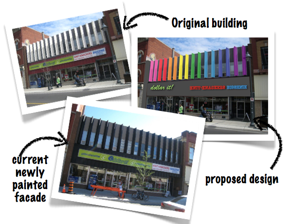
A couple months ago I posted an article about a particular building on Bank street that could use a touch of color. It was great to get positive feedback from you and see that some even wanted to get involved (See comments on MOOT's Facebook page here).

Imagine my surprise, when I recently passed by the place and noticed that it had been painted. Maybe it's a coincidence but it seems like the owner or tenant got the message and it looks much better. There's just a couple little things to fix to complete the new look and I really hope whoever is responsible keeps at it to make it a successful makeover. So if you're reading this (or someone who know that person does), please consider the three following suggestions:

1. Add some color
Now that the triangular panels of top portion are painted in the new charcoal grey, I doubt it will change to implement the initially suggested rainbow effect. Still this building needs a bit of color. The panels above the windows are a great alternative. They currently look beige and would look a lot better with some color. (Notice the left most panel is charcoal for continuity).
2. Finish the bottom portion
To really separate this renovated building from the old ones next to it and complete the new look, the bottom part should also be renovated, either by painting it or replacing the tiles so that it matches the new charcoal paint. The metal trim will look great against it too.
3. PLEASE modernize the signage
The big light boxes are old and bulky and take away from the architectural features of the building. Raised letter with LED light behind them would be ideal. Something like the signage in the photos below taken from my last trip in Las Vegas (shown below).

It's also a great opportunity for Knit Knackers and Biogenie to redo their logos as well so that they better represent what they are offering. I pass in front of that building on a regular basis and I had no idea Knit-Knackers was "Ottawa’s largest yarn and knitting store". There's nothing about the logo that indicate that.

Look how cute the logo from Ravelry (it's like facebook for knitters) is. Something along these lines would be fun and probably better portray the company. Maybe a sheep, a yarn and cat next to the company's name? How about the name knitted with a cute alpaca on the side?
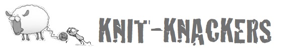

photo : ravelry | MOOT
haha seems like they are sick of it like you were as well- I like your idea of the rainbow scheme, I think it would look fun and appropriate on that part of bank for sure!
ReplyDeleteIndeed. But I don't think they're going to go for it... I'll have to find another building in the area ;)
ReplyDeleteI think that the owner of Knit Knackers raises angora rabbits, that might be a good thing to incorporate into a proposed logo.
ReplyDelete