The World Exchange Plaza is a hidden gem right in the heart of the commercial core of the city of Ottawa. It was designed by BBB Architects and built by PCL Constructors Eastern Inc. According to PCL's site, it was designed to house three cinemas with a total seating of 900, 40 retail boutiques, a 25,000-sf food court, and 10 retail kiosks in a department store-style open concept concourse. The design was chosen by the City of Ottawa in a National Capital Commission (NCC) competition (great choice!). The goal was to create a truly public and welcoming complex, while accommodating the demands for a first-class office building including a hotel and retail pedestrian shopping centre. "This active and holistic environment incorporates works of art, rooftop gardens, performance courts and botanical gardens and has 25% of its overall area dedicated to outdoor parkland and programmable public space."
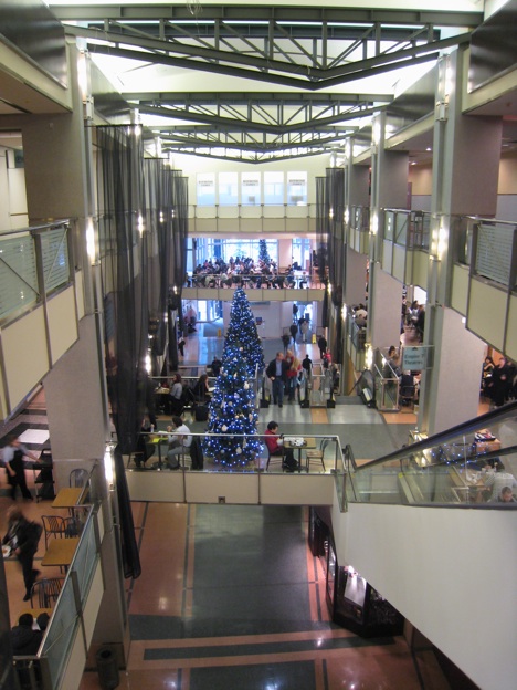
I went to check it out today in more detail and I find that the plaza has a lot of great features. The ceiling is nice and high and the center of the plaza is completely open. The metal trim finish and railings gives it a modern Art Deco style. Above the circular stairs, the ceiling has a circular indentation as well and a skylight. The recessed light around it and the wall sconces on top of the pillars gives it a very beautiful and grand look.
I also like the decorations that were added for Christmas, especially the chandeliers cascading in a spiral above the stairs. It's very glam. I wonder if the decorators were inspired by the 2009 Christmas Decoration trends. If so this would fit the Airy theme. In any case, I wish they would have added more to make it truly spectacular because it seems like this space deserves more. Perhaps something in the main area (like they did with dolphins in the first picture). Also, in the center of such a prominent focal point, an imposing attraction should take the place of the mini van.
Imagine if it had a tree like this one:
Or this one:
From what I understand, this mall was supposed to have a lot more retail spaces, but this is not the place for any fashionistas! It looks like the food court has taken over the second floor and the first floor only has a couple shops (LCBC, Shoppers Drugmart. etc), nothing that would attract serious fashion shoppers which is really a shame because it seems like it's the perfect location for that. Can you imagine if there were lots of stores there? Mango, MEXX, Diesel, H&M, Browns, Guess, Parasuco, etc.? Perhaps the NCC could use the help of a professional n management company that specializes in attracting retail tenants such as those. The World Exchange Plaza could stand along side the likes of the Eaton Centers in Montreal and in Toronto! And there's a cinema! I think there's enough people living downtown, students and tourists to make the plaza more alive because in the weekend (at least the last time I checked) it's pretty much dead.
photos : MOOT| chelsea.crank | jha442 | BBB |
25.11.09
Ottawa's World Exchange Plaza, a hidden gem
22.11.09
MOOT Flickr Update
18.11.09
Bixi bikes are alive and well in Montreal. Ottawa? Not so much... not yet
On a recent short trip to Montreal, I got to see that the Bixi bike system seems to be working just fine. In fact I saw many people on St-Laurent street well into the night (past midnight), riding the city bikes downtown. Later that evening, I even saw a city truck loaded with bikes, bringing them back to empty stations.
Maria Cook from Designing Ottawa wrote that Ottawa had a trial run for a short while for a feasibility study and then took them away. I'm not much of a cyclist, but I think a program like this has Ottawa citizens written all over it. This little city is perfect for Bixies. In any case, Montrealers and tourists are enjoying bicycle rides in the city. There are even maps to let people know where the Bixi stations are and they also have a well organized website with all the information you need.
So while Ottawa is studying the matter, the city of Montreal already has contracts to export their bikes to London (England) and Boston.
Oh and that great building in the background? That's the UQAM, one of Montreal's university. I just love the design of that building.
12.11.09
What is Ottawa's field of vision?
I love this presentation by Philippe Starck, world renowned designer, during a TED presentation on design. When he talks about "duty of vision" and how our field of vision affects our own evolution I can't help but think about recurring issues in Ottawa where there seems to be a misdirected vision or perhaps a lack thereof in the city (e.g. Lansdowne, Sparks Street, Laurentian High School, etc.) Here's the thing:
- Looking straight down, you have barely any chance of survival
- Looking angled down, you can survive but in a selfish way
- Looking ahead, you begin to live in society
- Looking angled up, you become more important to civilization
- Looking straight up or back, you're trapped
Like Starck said, if you follow the history of our evolution, in four billion years we went from a "stupid bacteria" to a "super-monkey" and we still have another four billion years to go. "The bacteria had no idea of what we are today and today we have no idea of what we shall be in four billion years."
The problem is "every generation thinks we are the final one". But we're not. We're only half way through and there so much potential to do a lot more, to do better and that means change. Going against change, is like going against our own evolution. I'm not saying that we should completely forget about the past, but it shouldn't stand in the way of the future. I think this is a problem in many cities including Ottawa where often when change is proposed many oppose.
What do you think?
11.11.09
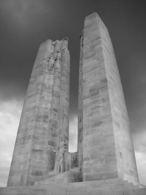
A look at the Vimy Memorial
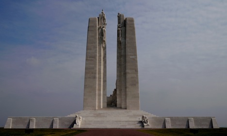
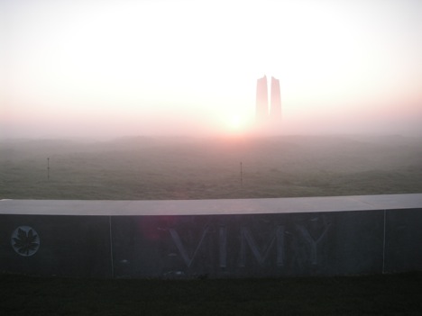
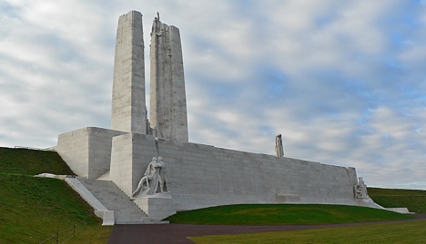
The Canadian National Vimy Memorial is one of the most stunning and profound war memorials in the world. Located in France, it is dedicated to the memory of Canadians killed in the First World War and serves as the place of commemoration for Canadian soldiers killed, or presumed dead, in France that have no known grave.
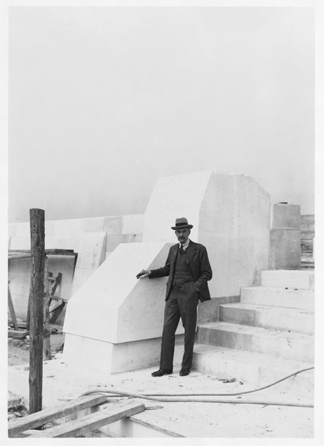
Designed by Walter Seymour Allward, a Canadian monument sculptor from Toronto, it contains several elements representing various aspects of the war. The monument includes 20 human figures that illustrate the reality of war. The Vimy Memorial took 11 years to build and was unveiled on July 26, 1936.
The front wall, typically mistaken for the rear, represents an impenetrable wall of defense. You can see a group of figures at each end of the it, next to the base of the steps, entitled Breaking of the Sword and Sympathy of the Canadians for the Helpless. Collectively, the two groups are The Defenders and represent the ideals for which Canadians gave their lives during the war. There is a cannon barrel draped in laurel and olive branches carved into the wall above each group to symbolize peace.
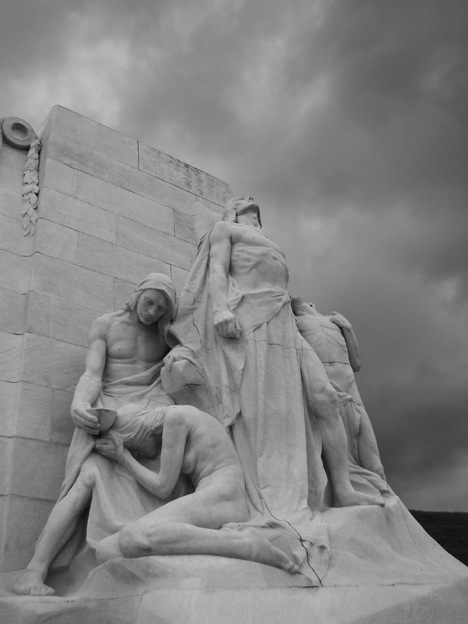
Sympathy of the Canadians for the Helpless
In Sympathy of the Canadians for the Helpless, one man stands erect while three other figures, stricken by hunger or disease, are crouched and kneeling around him. The standing man represents Canada’s sympathy for the weak and oppressed.
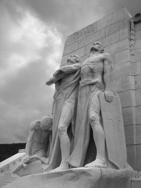
Breaking of the Swords
In Breaking of the Sword, three young men are present, one of whom is crouching and breaking his sword.This statue represents the defeat of militarism and the general desire for peace. This grouping of figures is the most overt image to pacifism in the monument, the breaking of a sword being extremely uncommon in war memorials. It's a very positive image.
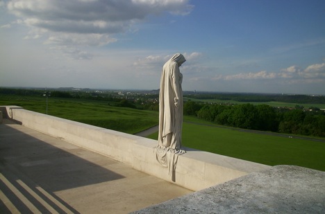
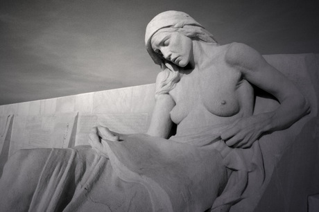
Canada Bereft (Mother Canada mourning her dead)
The figure of a cloaked young female stands on top of the front wall and overlooks the Douai Plains. It represents Canada, a young nation mourning her dead.The woman has her head bowed, her eyes cast down, and her chin resting in one hand. Below her at ground level of the former battlefield is a sarcophagus, bearing a Brodie helmet, a sword and draped in laurel branches. The stone sarcophagus represents Canada's war dead. The statue is the largest single piece in the monument and serves as a focal point. It's a very striking statue. I can only imagine what it must feel like to be there. I imagine many people around the world who have experienced war directly on indirectly can relate.
The twin pylons
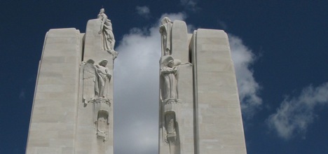
The twin pylons represent France and Canada as partners in arms. They rise to a height 30 metres above the memorial's stone platform. One of the pylons bears the maple leaf for Canada the other the fleur-de-lys for France. At the top of two pylons is a grouping of figures known collectively as the Chorus.
The Chorus
The statues of The Chorus represent various words. The most senior figures represent Justice and Peace. Peace stands with a torch upraised, making it the highest point in the region. BelowJustice and Peace, you can see the figures of Hope, Charity, Honour with the figures of Truth and Knowledge. Around these figures are shields of Canada, Britain and France. Large crosses adorn the outside of each pylon.
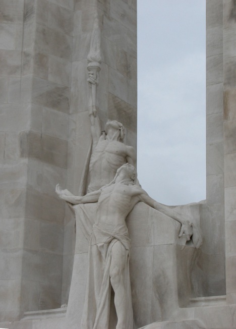
The Spirit of Sacrifice
The Spirit of Sacrifice is located at the base between the two pylons. In the display, a young dying soldier is gazing upward in a crucifixion-like pose, having thrown his torch to a comrade who holds it aloft behind him. The torch is passed from one comrade to another in an effort to keep alive the memory of the war dead.
Mourning Parents
The Mourning Parents, one male and one female figure on either side of the steps, are reclining on the reverse side of the monument. They represent the mourning mothers and fathers of the nation.
Names of the missing
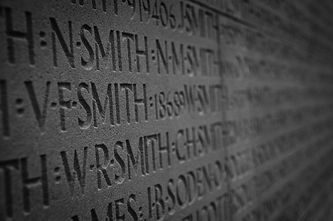
Inscribed on the outside wall of the monument are the names of the 11,285 Canadians killed in France, and whose final resting place is unknown. Most Commonwealth War Graves Commission memorials present names in a descending list format. Allward sought to present the names as a seamless list and decided to do so by inscribing the names in continuous bands, across both vertical and horizontal seams, around the base of the monument.
9.11.09
MOOT Home on Murray
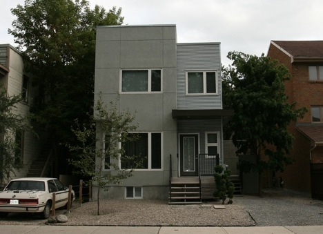
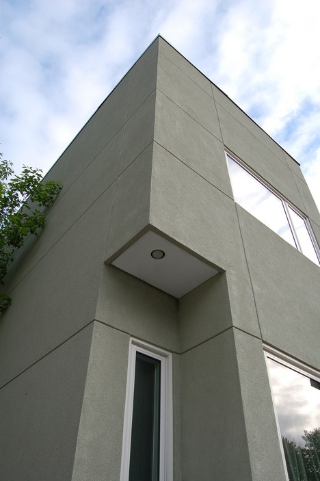
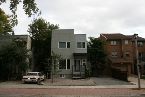
I remember, a little while back, when we were just thinking about maybe moving to Ottawa, I was looking at various homes for sale on MLS (just for fun) and I saw this neat little modern home on Murray Street. With a surface area of 1820 sq. ft, this infill residence is just the right size for a couple living in the city and it has a quite a few neat features.
Notice how there is no attached garage in the front. In this case it's a good thing because it would taken a huge portion of the front of this little house house and and most of the sunlight from that side. Instead, the occupants have a large window and a well proportioned entrance. Although a garage is practical, it makes no sense in a small home, specially if it takes half of the space in a house like the house on the right. To me that's what modern design is all about: Smart, simple and practical solutions.
It seems like this was a fun project to design. One of the challenges was that there was not a lot of land space so there's a zero lot line on two sides of the residence. To provide the occupant with some outdoor space, the architect, Andrew Reeves from LineBox Studio, included access to the roof to accommodate for a roof top patio with planters. Instead of a standard backyard, the owners have private panoramic view of the city. Talk about turning lemons in to lemonade!
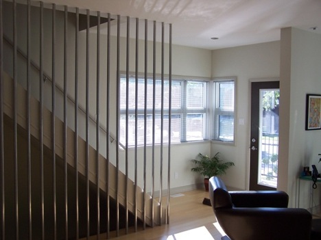
The inside is very nice too. I like how the stairs are separated by these metal columns as opposed to typical railing. It's a nice feature.
There's a nice simple kitchen too with a nice clean line for the cabinets in the back. Personally I would have placed a microwave/hood above the stove to gain more counter space, but it's a nice look. I love the recessed lighting too.
In the bathroom there's a custom sink that turns into a counter on the right. It's a nice sculptural touch I find.
Moderns homes can be affordable. Reeves, says that this one was built for less than $300,000. Looking at existing houses around the same price in Ottawa, I'd much rather a modern home like this. Maybe one day. Anyway, they are planning to install a green roof next summer. That should be interesting too.
photos: LineBox Studio
6.11.09
Mikaza Home showcasing student talents
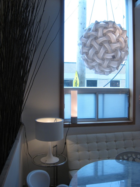
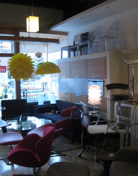
I finally had a chance to check out mikaza home a couple days ago. The name Mikaza comes from the names of its owners,Mirhan and Katia Zaroukiana, a husband and wife team who left their 9 to 5 job to start their own business. The store is a cute little place on Bank street specializing in modern furniture and accessories.
An interesting feature of the store is that they recently started to support local designers and are currently showing products made by local students.
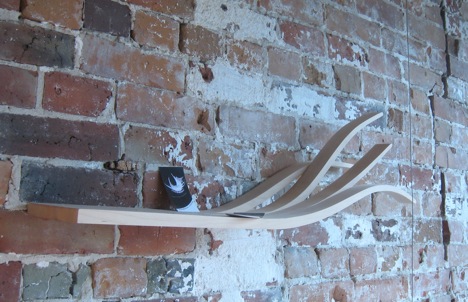
Poetry by Olivia Bradateanu is a very interesting floating shelve that opens up at one end into four strings curving up in various directions as if the wind had picked up. This gives the shelve a light and airy feel.
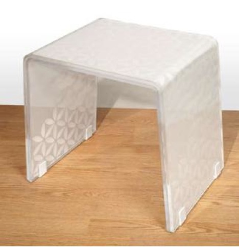
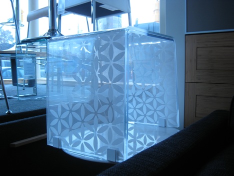
I also like Reflection by Shirley Wong. It's an acrylic side table that can be customized. It consists of two overlapping transparent tables with a decorative sheet sandwiched between them. In this case the designer used an ANNO LJUV panel curtain from IKEA.
Mikaza is planning something big for next year, so stay tuned for more.