Last Wednesday, I attended the launch for the upcoming re Hotel and Residences I mentioned earlier. It's great to see people taking matters into their own hand and revitalizing this street in great need of a lot of TLC! I thought I'd share my visit with you :)
As we came in, we were greeted by hostesses dressed in black, white and with a teal accent scarf. I thought it was a nice touch. After checking our names on the list we continued to the tent furnished with Mikaza Home furniture.
In the tent, you could look at some renderings for the project.


The lobby was great and grand. There was a DJ, lots of people, waiters serving drinks. (I had an really good lychee martini). I thought the colors used in the lobby were conservative (very neutral) but by using interesting material, it made the room interesting. Notice the mini subway tiles on the reception desk and the white tile on the wall.


There was some great scale models of the building project. The penthouse will have an amazing view of parliament. The project consists of a boutique hotel and luxury condos. Both will have an entrance on Queen Street. There should be retail stores on Spark Street. Finally. I really hope some great stores will come there. Hopefully whoever is in charge will seek appropriate tenants to help revitalize this area. As mentioned earlier by fellow blogger A.K.T. of Small City Streets we could use an anchor store such as H & M. But I would suggest bringing some great young, vibrant, fashion forward Canadian brands such as Rudsak, Mackage, Browns, Dubuc, etc. This is the place for flagship stores showcasing the best of what Canada has to offer! (Go big or go home).
THE BATHROOM
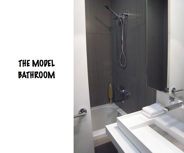
The model bathroom had some great features using modern fixtures. The floor to ceiling tiles created a neat effect (I was surprised to see they were the same than the ones I used for a client 2 years ago). There was a washer and dryer tucked away in a little closet on the side. The best feature for me was the extra tall cabinets behind the mirrors that provided ample storage. I thought it was really smart.


THE KITCHEN
The model kitchen was nice and sleek. From the look of it, it would be possible to host a party with a large number of people there. It was not a big kitchen, but I like the european style backsplash made out of colored glass. I wasn't sold on the light fixture above the table. They look a little too much for that small glass table, not to take away from the light fixtures themselves, because they look pretty awesome.


THE LIVING AREA
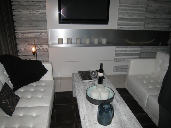
I really like the feature wall in the living room hiding storage behind and the stainless steel sleeve under the flat-screen TV. Imagine adding an ethanol fireplace in there. The small living room had access to a small balcony on the side as well.


THE BEDROOMS & ENSUITE
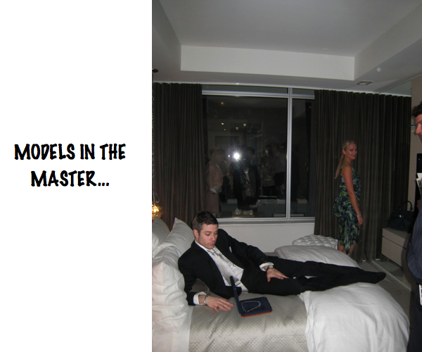
The master bedroom had real life models in it showcasing jewelry. Nothing against the model, but I didn't like that concept and though it looked a bit tacky. From the master bedroom you could access the second bathroom and the walk-in closet. It probably would have been better to inverse the bathroom and walk-in. The second bedroom was small but had great storage solutions.


So the old and ugly will eventually be replaced by the new and beautiful. And you can have a piece of it for a price. The smallest condo (570 sq. ft or 53 sq. m) starts at a little under $400,000. There are some great amenities that come with the purchase of one of these condos including underground parking, concierge, party room, lounge, theater, etc. Maybe I'll get to design some spaces in there. Now I really hope that the rest of the street will also get a face lift. You can see more pictures from the re hotel and residences website.

photos : MOOT | re hotel and residences
18.4.10
re Hotel and Residences Launch Party
Subscribe to:
Post Comments (Atom)

Okay, I seriously have to know where those accordion-style lights above the dining room table come from - any ideas?? Looks very cool though I wonder about a glass back splash...
ReplyDeleteI really like the bathroom especially the tiles.Do anyone has an idea of where I can find tiles like? I'm looking for something similar in light grey for my bathroom :)
ReplyDeleteOh, I wish I'd been there!! I got the invite, but didn't have anyone to go with :-(
ReplyDeleteLove the sink & faucet in the bathroom. The kitchen faucet is gorgeous too :-)
What's the wood on the wall in the living room?? It has a really unique look.
I'd love to design some spaces in there too!!
Kelly
@Ginger: I've seen them before... Let me take a look and get back to you on this.
ReplyDelete@Armel : I actually used similar tiles (if not the exact same ones) for a client of mine a couple years ago. They were porcelain tiles from Cera Gres called BAMBOO and I believe the color was called Walnut. I think I've seen them at Custom Home Interiors, Interscapes, and Ottawa Tile Centre.
@Kelly : Not sure. I think it's been customized. There was storage behind them too, which I though was great.
Very cool - unfortunately I wasn't able to make it :(. Yikes on the price though - $400K for 570 square feet? I'm with you Marie - hope I get to design a space in there someday!
ReplyDeleteWho makes that bathroom sink? Any brand name?
ReplyDeleteDo you know if the Re project has met its quota for sales to be able to start construction?
ReplyDelete@ Anonymous: I've seen them before but I can't remember where. If I get around to it I'll try to find out...
ReplyDelete@ Kevin : I don't know either but I'm sure the people at Bennett Real Estate Professionalswould have the information for your.
@Ginger: In case you're still looking for these lamps, Arteriors sell the Farley Polished Nickel Adjustable Hanging Lamp. It not exactly the same but it's pretty close. Custom Home Interiors in Ottawa sells products from Arteriors.
ReplyDelete