I recently discovered a pretty neat food court downtown Ottawa. It has a waterfall, plenty of natural greenery and a huge skylight. Whoever designed this place really brought the outside in. You feel like you're outdoors. It's a nice place to have lunch. It must be really nice in the winter to have a little oasis like this so close to your office. And it looks like there are a lot of offices around. The view must be nice from up there too.


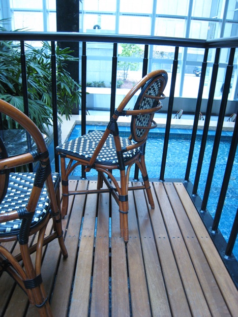
I love the huge sky light right above it. It reminds me of 1000 de la Gauchetiere in Montreal. There should be more office buildings with an indoor courtyard. I imagine the people working in such an environment must appreciate the natural surrounding, specially in the winter. Having natural lights and so many plants and trees can only be beneficial. It's very eco-friendly. In fact, commercial buildings get LEED points if they "provide the occupants with a connection between indoor spaces and the outdoors". I also like the flooring that looks like a deck. A portion of the seating area is right over the water feature and you can see the water running underneath.
1. Enhance the natural beauty
The blue tiles are not the best choice. Judging from their color and the design of the water feature, it was probably done in the 80s. The water feature also is a bit loud for the space. You have to talk louder in order for people to hear you. So I would replace the blues tiles by a natural stone like slate and I would reduce the speed of the water so that it would sound more like a stream as opposed to a waterfall.

2. Update the tables and chairs
The tables are way too low (probably 17 inches). People eating their lunch have to bend down to eat and it's not very good for their back. I would use table at a proper height (30 inches). Also the current chairs look like they belong to a plantation house as opposed to a building in the city.

Photo: MOOT
I think the furniture should better reflect their environment and be more innovative. So I would use something a bit more modern and unique like the Miss Petra chair by MYYOUR. Their curvy shape would add to the natural feel of the place, soften it and give it interest. Imagine these white chairs against the lush greenery and slate wall in the background. They would look like white flowers in the middle of the forest.


3. Create an unobstructed view
Lastly I would replace the current metal railing (a bit too prison-like for me) by clear glass railing.

Photo: MOOT

photo: glassrailing.net


OK - my curiosity is peaked -- what downtown Ottawa building is this lovely food court in. I work downtown and would love to spend my lunch hour enjoying this atmosphere.
ReplyDeleteDonna
dh designs
I think it's called the Sunlife Center.
ReplyDeleteThe glass roof is great -- really lets the outdoors in :-)
ReplyDeleteI love all the changes you would make to this space. You should talk to whoever is in charge see if you can turn your plans into reality!!
Kelly @ DesignTies
That would be awesome :)
ReplyDeletethose are great ideas - I meet my friends here for lunch all the time and was always wondering about the tables - who made that decision?!?! - they just don't work.
ReplyDelete(Especially nice to be here in the winter!) 240 sparks has a basement atrium with trees that is also a nice urban oasis. : )
I have to disagree on this one. I've eaten there many times and my favorite feature is the waterfall. It’s unique and the background noise makes it possible to have a discrete conversation. As for the blue tile; well if we made over everything according to the fickle whimsy of modern design we’d lose the great works from everyone that came before us.
ReplyDeleteWhen they do make over the space I hope they preserve the one element that sets it apart from every other food court in the city.