
As of April 2011, Ottawa has a new landmark we can all be proud of, thanks to BBB Architects, who designed it. You can't miss it. It's the big biomorphic glass building located right by the Rideau Canal : The Ottawa Convention Centre. I finally got a chance to visit the building on a beautiful sunny day recently and the architecture is truly spectacular. So here's a summary of my little tour for your viewing pleasure.
Outdoors


I just love the shape of this building. I imagine you'll see it on many postcards and illustrations of the city for many years to come. It's the kind of building that will entice people to come and see it with their own eyes. The sidewalks around the entrance are wide and nicely paved, and includes a nice little seating area with a couple trees and large wood beams used as benches. They also acts as a barrier between the pedestrian area and the road.
Indoors


All this glass provides a great amount of natural light inside the building, as well as a great view of the Canal. It gives you a nice feeling as you walk through the space.
The interior design is also coherent throughout the building, which is nice. There's a large "block" of dark chocolate slats on each floor with a blue light behind it. It creates a nice focal point in the building and great texture as well. So the space is not visually boring.


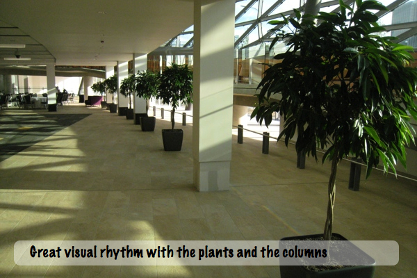
On the first floor, there's a series of potted plants that create a visual rhythm along with the columns and adds to the esthetics of the place. The seating area viewed from the escalator provides a really nice setting for taking pictures of events such as corporate parties or weddings for example. Quite inspiring for various photo opts.

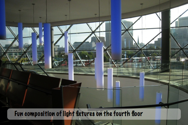
On the top floor, there's a nice grouping of pendant lights that also doubles as an art installation. I wonder if they can change color. It would be fun to create different ambiences depending on the event.
The doors leading to the conference area are etched with images from the city depicting buildings such as the parliament, which is a nice touch.

All in all the design of the building is well done and can compete with other international landmarks. However, I have to point out one recurring "issue" I noticed the day that I visited : tidiness. If not addressed, the lack of tidiness can completely eclipse all the effort that went into erecting such a beautiful building in the city. Why? Well, first of all it shows lack of care (which is kind of disrespectful if you ask me) and second, garbage attracts more garbage.
Here's what I saw on my way out from the top floor : Trash randomly sprinkled on the 3rd, 2nd and main floor, including cardboard boxes piled up in random places, open trash cans, empty bottles of water, empty cups of coffee, plates with crumbs, etc. and no staff in sight to clean it. Not good.
I don't understand why there wasn't anyone there cleaning this up. Obviously the event that took place earlier was over a while before, where was the cleaning crew? It gives a really bad impression to visitors and it's distracting. I hope really this was a fluke and that whoever is responsible for the maintenance of the building keeps the building in top shape. You only get one chance to make a good first impression.


The vision stated on NCC's website is to "inspir[e] people creating extraordinary events", so I hope they do and a lot of beautiful and creative events take place in this building. More than that, I hope it spreads outside the building and helps improve the area even more because it has the potential to become even greater. Now that we have such a beautiful building next to a beautiful canal, it's time to take it to the next level and attract more people to come and enjoy it. Here's three points that came to mind:
1. Bring back the green to bring more people.
I found a picture of the canal from 2007 and compared it to a picture I took recently and it looks like we lost a lot of green around the canal in the past few years. The pavement is nice but it's not as inviting as the green area that was there before. The green created a barrier between the cars and canal. It looks more suiting for people to walk by, relax and enjoy the view. In fact, it was sad to see how deserted the area was on such a beautiful day. But I imagine it's not very comfortable or people friendly. If it was up to me, I would bring back more trees, more grass or plants around.

2. Freshen up the paint
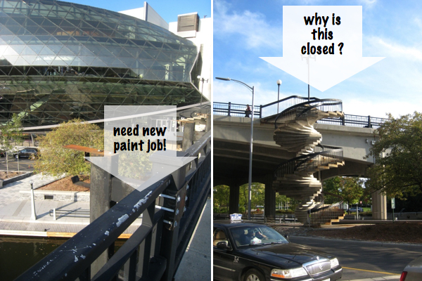
The bridge that crosses the canal needs a little TLC. It's not expensive and it's effective. In fact, why not paint it red?
3. Refresh and let us use this beautiful staircase
There's this really neat spiral staircase I noticed coming down from the bridge. It looks like a piece of art that's slowly dying. All it needs is a little TLC. Why not give it a little bit of color as well. It deserves a bit of attention. It's such a beautiful structure and it's fun. Unfortunately it was closed. I wonder why.
Photos : Hussein Abdallah| MOOT
Outdoors


I just love the shape of this building. I imagine you'll see it on many postcards and illustrations of the city for many years to come. It's the kind of building that will entice people to come and see it with their own eyes. The sidewalks around the entrance are wide and nicely paved, and includes a nice little seating area with a couple trees and large wood beams used as benches. They also acts as a barrier between the pedestrian area and the road.
Indoors


All this glass provides a great amount of natural light inside the building, as well as a great view of the Canal. It gives you a nice feeling as you walk through the space.
The interior design is also coherent throughout the building, which is nice. There's a large "block" of dark chocolate slats on each floor with a blue light behind it. It creates a nice focal point in the building and great texture as well. So the space is not visually boring.


On the first floor, there's a series of potted plants that create a visual rhythm along with the columns and adds to the esthetics of the place. The seating area viewed from the escalator provides a really nice setting for taking pictures of events such as corporate parties or weddings for example. Quite inspiring for various photo opts.


On the top floor, there's a nice grouping of pendant lights that also doubles as an art installation. I wonder if they can change color. It would be fun to create different ambiences depending on the event.

The doors leading to the conference area are etched with images from the city depicting buildings such as the parliament, which is a nice touch.

All in all the design of the building is well done and can compete with other international landmarks. However, I have to point out one recurring "issue" I noticed the day that I visited : tidiness. If not addressed, the lack of tidiness can completely eclipse all the effort that went into erecting such a beautiful building in the city. Why? Well, first of all it shows lack of care (which is kind of disrespectful if you ask me) and second, garbage attracts more garbage.
Here's what I saw on my way out from the top floor : Trash randomly sprinkled on the 3rd, 2nd and main floor, including cardboard boxes piled up in random places, open trash cans, empty bottles of water, empty cups of coffee, plates with crumbs, etc. and no staff in sight to clean it. Not good.
I don't understand why there wasn't anyone there cleaning this up. Obviously the event that took place earlier was over a while before, where was the cleaning crew? It gives a really bad impression to visitors and it's distracting. I hope really this was a fluke and that whoever is responsible for the maintenance of the building keeps the building in top shape. You only get one chance to make a good first impression.


The vision stated on NCC's website is to "inspir[e] people creating extraordinary events", so I hope they do and a lot of beautiful and creative events take place in this building. More than that, I hope it spreads outside the building and helps improve the area even more because it has the potential to become even greater. Now that we have such a beautiful building next to a beautiful canal, it's time to take it to the next level and attract more people to come and enjoy it. Here's three points that came to mind:
1. Bring back the green to bring more people.
I found a picture of the canal from 2007 and compared it to a picture I took recently and it looks like we lost a lot of green around the canal in the past few years. The pavement is nice but it's not as inviting as the green area that was there before. The green created a barrier between the cars and canal. It looks more suiting for people to walk by, relax and enjoy the view. In fact, it was sad to see how deserted the area was on such a beautiful day. But I imagine it's not very comfortable or people friendly. If it was up to me, I would bring back more trees, more grass or plants around.

2. Freshen up the paint
The bridge that crosses the canal needs a little TLC. It's not expensive and it's effective. In fact, why not paint it red?
3. Refresh and let us use this beautiful staircase
There's this really neat spiral staircase I noticed coming down from the bridge. It looks like a piece of art that's slowly dying. All it needs is a little TLC. Why not give it a little bit of color as well. It deserves a bit of attention. It's such a beautiful structure and it's fun. Unfortunately it was closed. I wonder why.

Photos : Hussein Abdallah| MOOT

I was under the impression that they were closing the spiral stairs from Mackenzie King, as new stairs were built with the Convention Centre. Really a shame; now you have to cross Colonel By to access the canal (through faux crosswalks no less)
ReplyDeleteThanks for your profile of the convention centre. I really love this space and I'm so proud of Ottawa for getting it done.
ReplyDeleteI disagree with "1. Bring back the green to bring more people." The previous green space in your picture consisted of huge humps of dirt that created a barrier to the street and were not what I would consider usable green space. You either had to scramble over them or go around. I actually tended to avoid that side of the canal because you'd be locked into a lane- either right next to the canal or right next to the street- the openness of the space is much more agreeable now.
I MUCH prefer ease of access to the street and I think the materials they used are really nice. I think it being deserted was a fluke- I've certainly since that area very busy this summer.
In general, I find that Ottawans love to trumpet "green space" without any regard to how the space will actually be used.
I love this building but the only thing I regret about it is it's not a mixed-use building. If you don't have an event to go to you can't experience the views. Vancouver's convention centre houses art exhibits and a cafe.
ReplyDeleteI like how the tile in front of the centre blends into the tile at the waterfront plaza like it's one space. Unfortunately, like many other places in Ottawa, the plaza along the canal looks great but it doesn't attract people.
PS: The pendant lights do change colour. I've seen them in green and red. And according to Eric Darwin the spiral staircase is being removed. Here's the article:
http://westsideaction.wordpress.com/2011/06/22/indistinguishable-crosswalk-lures-peds-to-danger/
It's gorgeous but since I live close by I've started to notice the untidiness. You can even see boxes scrunched up against the windows when you walk by.
ReplyDeleteThat amazing staircase has been closed for a full year now. I've moved here a year ago and used them only once. Yet I see it everyday. It's taunting me.
@Anonymous: I don't get the faux crosswalks. Not the best design.
ReplyDelete@Betsy. Interesting... Perhaps if the green was at the same level it would solve both problems of not having access to it and not having enough nature in the city?
Thanks @Kevin for the info :) You're right it would be better if it was more accessible. It would certainly bring a bit more life to the space. It was pretty quiet when I was there in the early afternoon.
@Anonymous : It's taunting me too :) That's a real shame about the tidiness : one of my biggest pet peeves in a public space, specially a building like this.
From what I've heard the spiral staircase is closed for good - not up to code or not at all accessible - can't remember. It was in disrepair and because of all these reasons they replaced it with the new ones. Don't know when they will take it down though! Definitely is taunting us all!
ReplyDelete