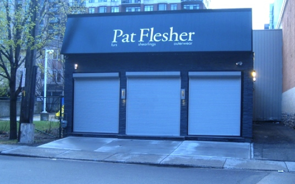
I was walking along Cooper street yesterday and noticed this beautiful modern little store (Pat Flesher) that really stood out. Of course I had to take a picture to share with you.
The design is very understated but very effective, the signage is simple and to the point and the lighting emphasizes the beautiful texture of the stone wall veneer. Very classy!
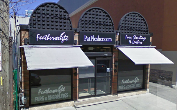
Check out the "before" photo of the store from Google StreeView. It really needed a makeover. What an improvement! It's such a simple makeover but what a difference it makes. 


No comments:
Post a Comment
Note: Only a member of this blog may post a comment.