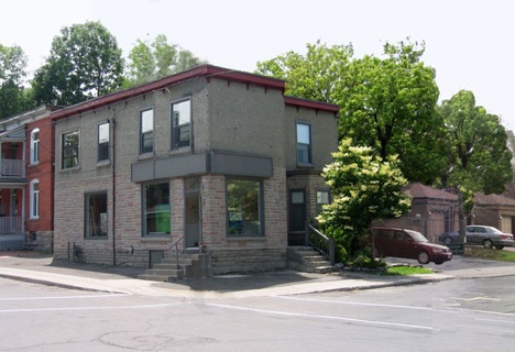
I discovered this beautiful modern building in the Glebe neighborhood and I just had to share it with other modern architecture lovers! After doing a little bit of research, I found out that the building is part commercial and part residential. The store is called Oresta. It's an organic skin care confectionery offering natural beauty and personal care products, as well as chemical-free and earth-friendly treatments. Oresta Korbutiak is the owner of the store and also lives in this building with her family.

photo : Modern Ottawa
This is what the building used to look like :

photo: Kariouk Architecture
It wasn't very impressive and looked tired. But now, it's definitely an eye catcher and the art engraved on the concrete and above the main window, give it personality. I love the contrast of the wood and the concrete.

photo : Modern Ottawa

photo : Modern Ottawa
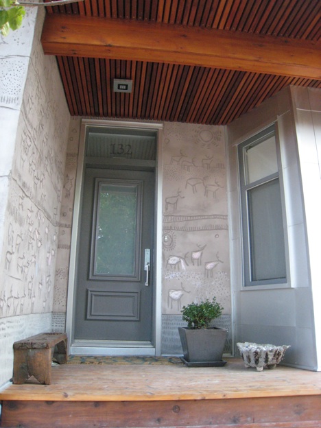
What's really neat too is the art that's been carved in the concrete. The art was created by Christopher Griffin, Oresta's husband, who's an artist. It took him about four months to do. According to his site, he's inspired by ancient artwork on cave walls, children’s art and random markings on concrete sidewalks, roads and buildings. He also often [uses] bird, fish and animal motifs in [his] work because they represent the pure, the innocent and the spiritual.

photo : Modern Ottawa

photo : Modern Ottawa
The main entrance of the residential area is also stunning with the ceiling made out of wood and the cave like carving on the wall, the little planter and bench which make it very inviting.

photo : Modern Ottawa
I absolutely love the fence and the balcony on the side of the building and the large beluga carving. There a very nice attention to details in this building and around it. Look at the walkway leading to the yard with the sunshine carving on the concrete sidewalk and the little stone wall. Beautiful!

photo : Modern Ottawa

photo : Modern Ottawa

photo : Modern Ottawa
(link)
9.8.09
I received an email from Ivan who tells me that the architect for this beautiful project is Andrew Reeves of LineBox. I checked out their site and they have a very nice portfolio. Thanks Ivan!

Great building, Marie... the carvings in the concrete are terrific, but I especially love the use of horizontal cedar strips. Such a fantastic and modern look!
ReplyDeleteThanks for dropping by DesignTies and commenting on the transformation of my nesting tables. We're really happy with the results! You're right - the tables look good with the tiles of our fireplace surround... but eventually the tables will be going downstairs into our family room. I think they'll look FAB there, too!
Cheers,
Victoria
I drive past this fabulous place all the time. It has been a remarkable evolution, and the results are stunning. It's an uniquely personal expression and yet it's appeal is somehow universal.
ReplyDeleteGreat post!
I agree, Oresta is a beautiful little place and her products are just amazing. I had the opportunity to interview Oresta and tour her busienss when I was a volunteer writer at the Glebe Report. I really like that her products are chemical-free, and they all smell yummy.
ReplyDeleteLots of work done there since I was there last, wow.. looks fantastic!
The info about 'Oresta' is factually wrong. The idea to carve that facade and the layouts of all the panels are not the work of Andrew Reeves at all but Kariouk Associates -- Reeves took Kariouk's design and published it as his own work. (After Kariouk designed it for Griffin and Korbutiak they put the project on hold and more than a year later got Reeeves to just manage construction but using Kariouk's design and drawings. If you take a look at http://kariouk.com/projects/urban_cornfield.php you can see all the other design iterations produced for those clients including the idea of the carvings that precede the built project by over a year. Reeves is just a rip off 'artist' (who it seems faced a copyright lawsuit for his dispicable actions.
ReplyDeleteI often see cedar finished in this fashion and I cringe.
ReplyDeleteWhy architects, designers, etc. have not learned that this is a fleeting look which will eventually turn grey, I do not understand.
Those who live on the east and west cost understand that the "natural" way to use cedar as an exterior material is to let it go grey. Cedar ages beautifully and when applied properly as a surface material by allowing the backside to "breathe" and act as a rainscreen it will last for hundreds of years similar to barn boards.
Look at New England saltboxes and Cape Cods and the more modern houses along the west coast from Northern California, the Oregon Coast, right into BC, especially the west coast of Vancouver Island well hidden along the several beaches south of Tofino.
Actually....If you want to see how and where the engravings idea started look at 474 and 472 Sunnyside ave. (2004) during his visit whit the dean of Architecture during an open house. This house has the engraved concrete and is the place that Chris (owner and artist) first saw this idea and then expanded on its possibilities with his person artistic talents. Can the Author of the July 5, 2001 comments state his / her name as you did write some very slanderous comments and ones that are not factually true.
ReplyDeleteSo I just went to the Kariouk site to see in fact if the allegations are true. It seems like Kariouks "design" of the existing structure was to add some lattice, some greenery and small sort of concrete brick facade. The proposal on his website looks nothing like the final project .... Thank goodness because the Kariouk proposal is somewhat unsightly....hence the reason the project may have been put on hold for a year. There is no mention of engravings at all on Kariouks sight. Sounds like there is a disgruntled architect that lost a client on account of different visions.
ReplyDeleteHey, i am very interested in this technique: i can't quite understand how was it actually achieved - was the concrete wet or was there some scaffolding on? The site you mentioned:
ReplyDeletehttp://kariouk.com/says:
"Design Solution: to use new coloured stucco as a surface into which the client, being a well-known local artist, would carve a large mural to feature his work. The façade was to become a giant canvass and, essentially, a billboard for the art studio within."
I guess stucco is inexpensive and easier but concrete is so much more impressive - was it some soft or workable type?
Hi. The material used was concrete. The final result is the work of the artist, Christopher Griffin, and architectural firm Linebox Studio.
DeleteGriffin recently completed another project using the same technique for the Ledbury Community Centre and posted some information about it on his website here.
To get more info about the process, I would suggest contacting the artist directly, as he's the expert at his craft. From what I understand he basically inscribed concrete before it dried and had to work quickly. Hope this helps
There's also a little story about the exterior wall for the Oresta building here
DeleteThe exterior is exterior cement board with wire mesh on top then two layers of concrete trowed over the metal lath (like parging over a foundation walls) and then a final thin coat of concrete (no stucco used at all) in which Chris engraved his artwork one section at a time. We used "random" reveals and aluminum "T" sections at the wood/concrete change of materials. Chris had to engrave each section (while wet) at a time while Bill(concrete specialist and installer) stayed ahead of him. Chris also had to engrave the walls while scaffolding was all around him and covered due to rain. Very impressive to see. We also used "blue skin" waterproof backing at all reclaimed wood locations (very old subfloor planks found in Chris's basement) to ensure a waterproof backing and to allow the wood to float off the walls. The concrete itself is mixed with Flyash (a sustainable mix). The wood is reclaimed and cedar (west coast) and the metal is aluminum
DeleteConcrete
http://flyash.sustainablesources.com/
Hope that helps
Andrew Reeves - Architect