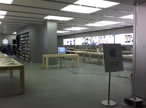
So it seems like the Apple store in the Rideau Centre is ready to go. Unfortunately, design wise, I can't help but feeling disappointed. Why didn't anyone take advantage of this opportunity to create an attractive landmark for Ottawa? From the picture on Apt. 613's blog, it's not looking soo hot. The inside looks like an old office from the 80s: Boring floor, boring wall, boring ceiling, everything looks gray. There's nothing about the design of the space that says modern, clean, clever, minimalist, avant-garde... you know just like the design of a Mac! In fact, I would say that the space looks more like a PC than a Mac.
There's no wow factor compared to other stores around the world.
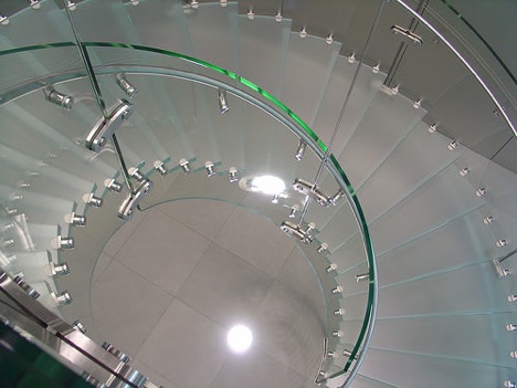
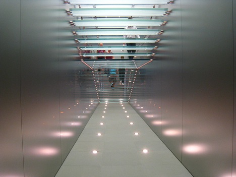
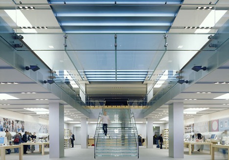
Take a look at the Apple store in New York


photos: z107matt
The store in Osaka, Japan
 Photo: jebni
The store in Sydney, Australia


One thing I notice about the really striking examples you post is that they're all multi-storey -- allowing things like the glass staircases and overlooks and more spectacular lighting. I can't tell for sure, but I bet they all have exterior windows as well.
ReplyDeleteThere's only so much you can do with a store slot at the Rideau Centre, even if it's a double-wide, and still fit the general Apple Store Aesthetic.
That probably says more about the Rideau Centre than it does about Apple, except inasmuch as Apple decided the Rideau Centre was the best place to be. They might have done something more transformative and exciting in a space on Rideau Street or at the north end of Bank, instead. Ottawa may not be an important enough market for that kind of investment, though.
I popped in Sunday afternoon and was struck by how functional the space is. Empty, it looks ... well, empty, but yesterday there was just barely enough room to hold all the customers the store was crawling with. Put all those people in there and it doesn't seem nearly as stark.
It is a contrast to the two Radio Shacks (sorry, "The Source"), EB Games and the now-closed CompuSmart in that mall, if they're the "PC" standards for computer and personal electronics stores.
true that, i agree...they could have done much better!
ReplyDeletelmao at the pc vs mac comment!
I am sure they could have found a better location or insisted on more extensive modifications at the rideau center, but they knew that they can get away with it here.
ReplyDeleteDemand better Ottawa! Stop being so nice! :)
Are you serious?
ReplyDeleteYou're actually trying to compare the Apple store in New York City(pop 8,363,710) to the Apple Store in Ottawa( pop 1,200,000)
Does the word demographics mean anything to you?
LOL
@Anonymous (No 2): Of course I'm serious. Demographics have nothing to do with good design. I think it's time to stop using excuses to accept the bare minimum. Ottawa deserves a lot better than that, but it's up to the people of Ottawa to make it happen. Don't you think?
ReplyDeleteLook at the Apple Store in Southlake Town Square (small town of 21,000 in Texas) here : http://www.apple.com/retail/southlaketownsquare/ and here :
http://images.apple.com/retail/images/store_photos/photo_southlaketownsquare.jpg
We should be happy to have an Apple store at all. Think about the likely alternative: some medium-priced clothing store with less personality and less business.
ReplyDeleteSometimes people get the complain button stuck down. Let's try to be happy occasionally.
given the economy and the funds the owners had to invest its seems ok. Not everyone has a million to start a store.
ReplyDeleteIt's simple the store is in a mall and conforms with the standard apple mall store designs and finishes... Only flagship stores are given the special treatment in terms of design... So far Canada only has one flagship apple store in montreal... All of the other apple stores you compare it to are flagship locations... It's not really a fair comparison and is if you'll pardon the pun somewhat like comparing apples and oranges...
ReplyDelete